I know many G-Shock fans are also fond of Seiko’s “Spirit Digital / Power Design Project Digital” – the SBPG001. It’s similar, in concept, to the well-loved Casio GW-M5600. As one of Seiko’s very few digitals introduced during a 20-year hiatus, it’s generated a lot of interest and enthusiasm. I know it was well-reviewed and discussed HERE and HERE.
I’ve just purchased the Seiko SBPG001 and posted up a review and comparison to the Casio GW-M5600 in the Casio G-Shock forum, as well as below:
I’ve seen this watch (ref. SBPG001) referred to by a couple of nicknames, including “Spirit Digital” and “Power Design Project Digital”. Well, I’ve just purchased one, and after living with it for a few days, here are some initial impressions & review points:
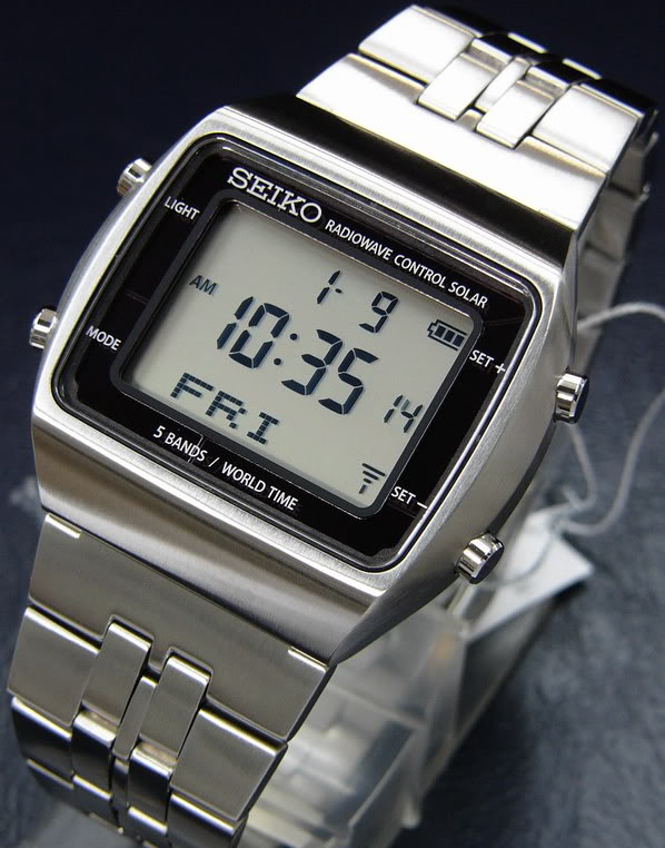
Glamour shots courtesy of Tanaka:

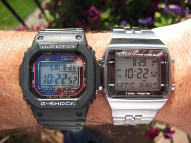
It's very nice, and a great compliment to the Casio G-Shock GW-M5600 I own and enjoy. (Apologies in advance that I’m just not a great watch photographer. Caution, glare and reflections ahead!)

Physical characteristics
· The case and bracelet are large and stately -- a bold presence, but in a subtle way. It’s eyecatching, without shouting.
· I don’t normally like wearing a large watch, but this one seems different, being the sleeker digital format with a tapered & beveled shape that makes its 41mm size very manageable for me.
· The watch is hefty, dense, and very well crafted and finished. Seiko’s meticulous attention to detail is evident. And the lustrous, satin finely brushed finish give the watch an expensive look and feel that’s hard to capture in pictures.
· The solid link bracelet, in shape and construction, actually reminds me a lot of the one on the Rolex OysterQuartz. Nice clasp with three holes for micro-adjustment. Conventional pinned links for easy removal.
General operation and display
· I very much like the setup and the "flow" of the features and screens, maybe even better than the Casio way (again, my reference point is the GW-M5600). Very well thought out and quick & intuitive to use.
· The LCD display panel is large and "airy", as it takes up a higher proportion of the front of the watch than the Casio . . . which means the digits and information have more room to breathe. I never would have said the Casio display looked small or crowded, until now that I have a point of comparison that sort of makes it look that way.
· The space surrounding the display is very clean and sparse compared to the Casio, which is festooned with words and decorations like a Nascar.
· The words on the Seiko bezel sort of “float” above the smoked gray mirror-like solar panel that’s below the glass, a nice touch that you don’t appreciate from the pictures.
· The little indicators for battery charge level and atomic synch reception are cool – they’re styled like those on a cell phone. Seiko provides dedicated “AM”, “PM” and “DST” indicators for main, secondary, and dual time displays, plus little blinking icons whenever the stopwatch and/or timer are running.
· I like the line of dot-matrix text at the bottom of the display. It provides flexibility, and makes many of the modes that much easier to use and quickly interpret. Casio should consider implementing a similar concept.
· There’s a fun “test” screen where you can see all the elements of the LCD display:
Features and other aspects...
· The alarm sound is plenty loud (unlike the GW-M5600, which has been compared to a gnat’s fart) and has a pleasant warbling tone, almost like a vintage cell phone ring.
· It lacks an hourly chime option (an unusual omission).
· The luminescence is adequate, but not quite as vividly bright as the Casio.
· The dual time mode is very well done and it’s super easy to scroll through the zones, make your selection, and swap back & forth between home & dual time zones.
· I appreciate that there are two separate time zones for UTC and for London – to account for the difference between “pure” GMT time and London’s daylight savings time.
· And, finally, praise the Lord – the Seiko shows the time in the secondary display in all modes, and has a 10 hour countdown timer capability!
· Here’s a link to the pdf owner’s manual.
In summary, this is a very nice watch. I think it plays the role of a “business suitable” version of a GW-M5600, and is actually superior to it in several ways. It's not a bargain (like I would say the GW-M5600 is), but I do believe that its overall thoughtfulness of design, its heft, craftsmanship, and fit & finish, and frankly, its rarity & uniqueness, all combine to provide a level of quality commensurate with the price.
Cheers,
Dave
PS - Talk about timely delivery service . . . I placed my online order on Sunday evening to Seiya in Japan, and Wednesday at noon it was on my wrist in Minnesota.
Final glamour shots, courtesy of Molle:
Dave
©
I’ve just purchased the Seiko SBPG001 and posted up a review and comparison to the Casio GW-M5600 in the Casio G-Shock forum, as well as below:
I’ve seen this watch (ref. SBPG001) referred to by a couple of nicknames, including “Spirit Digital” and “Power Design Project Digital”. Well, I’ve just purchased one, and after living with it for a few days, here are some initial impressions & review points:
Glamour shots courtesy of Tanaka:

It's very nice, and a great compliment to the Casio G-Shock GW-M5600 I own and enjoy. (Apologies in advance that I’m just not a great watch photographer. Caution, glare and reflections ahead!)

Physical characteristics
· The case and bracelet are large and stately -- a bold presence, but in a subtle way. It’s eyecatching, without shouting.
· I don’t normally like wearing a large watch, but this one seems different, being the sleeker digital format with a tapered & beveled shape that makes its 41mm size very manageable for me.
· The watch is hefty, dense, and very well crafted and finished. Seiko’s meticulous attention to detail is evident. And the lustrous, satin finely brushed finish give the watch an expensive look and feel that’s hard to capture in pictures.
· The solid link bracelet, in shape and construction, actually reminds me a lot of the one on the Rolex OysterQuartz. Nice clasp with three holes for micro-adjustment. Conventional pinned links for easy removal.
General operation and display
· I very much like the setup and the "flow" of the features and screens, maybe even better than the Casio way (again, my reference point is the GW-M5600). Very well thought out and quick & intuitive to use.
· The LCD display panel is large and "airy", as it takes up a higher proportion of the front of the watch than the Casio . . . which means the digits and information have more room to breathe. I never would have said the Casio display looked small or crowded, until now that I have a point of comparison that sort of makes it look that way.
· The space surrounding the display is very clean and sparse compared to the Casio, which is festooned with words and decorations like a Nascar.
· The words on the Seiko bezel sort of “float” above the smoked gray mirror-like solar panel that’s below the glass, a nice touch that you don’t appreciate from the pictures.
· The little indicators for battery charge level and atomic synch reception are cool – they’re styled like those on a cell phone. Seiko provides dedicated “AM”, “PM” and “DST” indicators for main, secondary, and dual time displays, plus little blinking icons whenever the stopwatch and/or timer are running.
· I like the line of dot-matrix text at the bottom of the display. It provides flexibility, and makes many of the modes that much easier to use and quickly interpret. Casio should consider implementing a similar concept.
· There’s a fun “test” screen where you can see all the elements of the LCD display:
Features and other aspects...
· The alarm sound is plenty loud (unlike the GW-M5600, which has been compared to a gnat’s fart) and has a pleasant warbling tone, almost like a vintage cell phone ring.
· It lacks an hourly chime option (an unusual omission).
· The luminescence is adequate, but not quite as vividly bright as the Casio.
· The dual time mode is very well done and it’s super easy to scroll through the zones, make your selection, and swap back & forth between home & dual time zones.
· I appreciate that there are two separate time zones for UTC and for London – to account for the difference between “pure” GMT time and London’s daylight savings time.
· And, finally, praise the Lord – the Seiko shows the time in the secondary display in all modes, and has a 10 hour countdown timer capability!
· Here’s a link to the pdf owner’s manual.
In summary, this is a very nice watch. I think it plays the role of a “business suitable” version of a GW-M5600, and is actually superior to it in several ways. It's not a bargain (like I would say the GW-M5600 is), but I do believe that its overall thoughtfulness of design, its heft, craftsmanship, and fit & finish, and frankly, its rarity & uniqueness, all combine to provide a level of quality commensurate with the price.
Cheers,
Dave
PS - Talk about timely delivery service . . . I placed my online order on Sunday evening to Seiya in Japan, and Wednesday at noon it was on my wrist in Minnesota.
Final glamour shots, courtesy of Molle:
Dave
©